-
→catalogue of influences
#publication design
#editorial design
5.83in × 8.27in -
→multiple format
#mortion graphic
#kinetic typography -
→tokyo art book fair
#mortion graphic
#kinetic typography
#branding -
→all about infj
#typography
#printing
-
→print to motion
#mortion graphic
#kinetic typography -

→ambit
#branding
#mortion graphic
#package design -

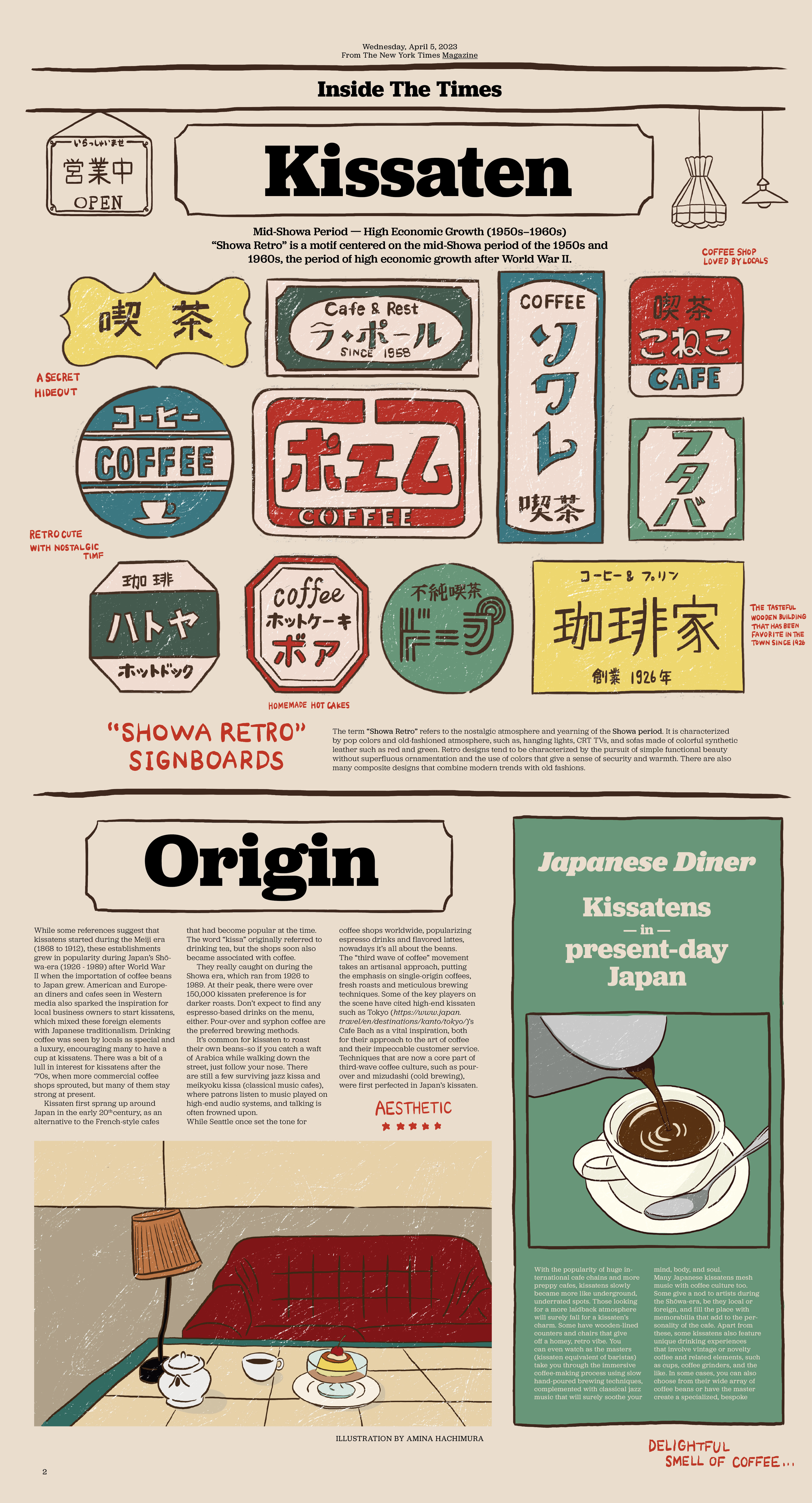
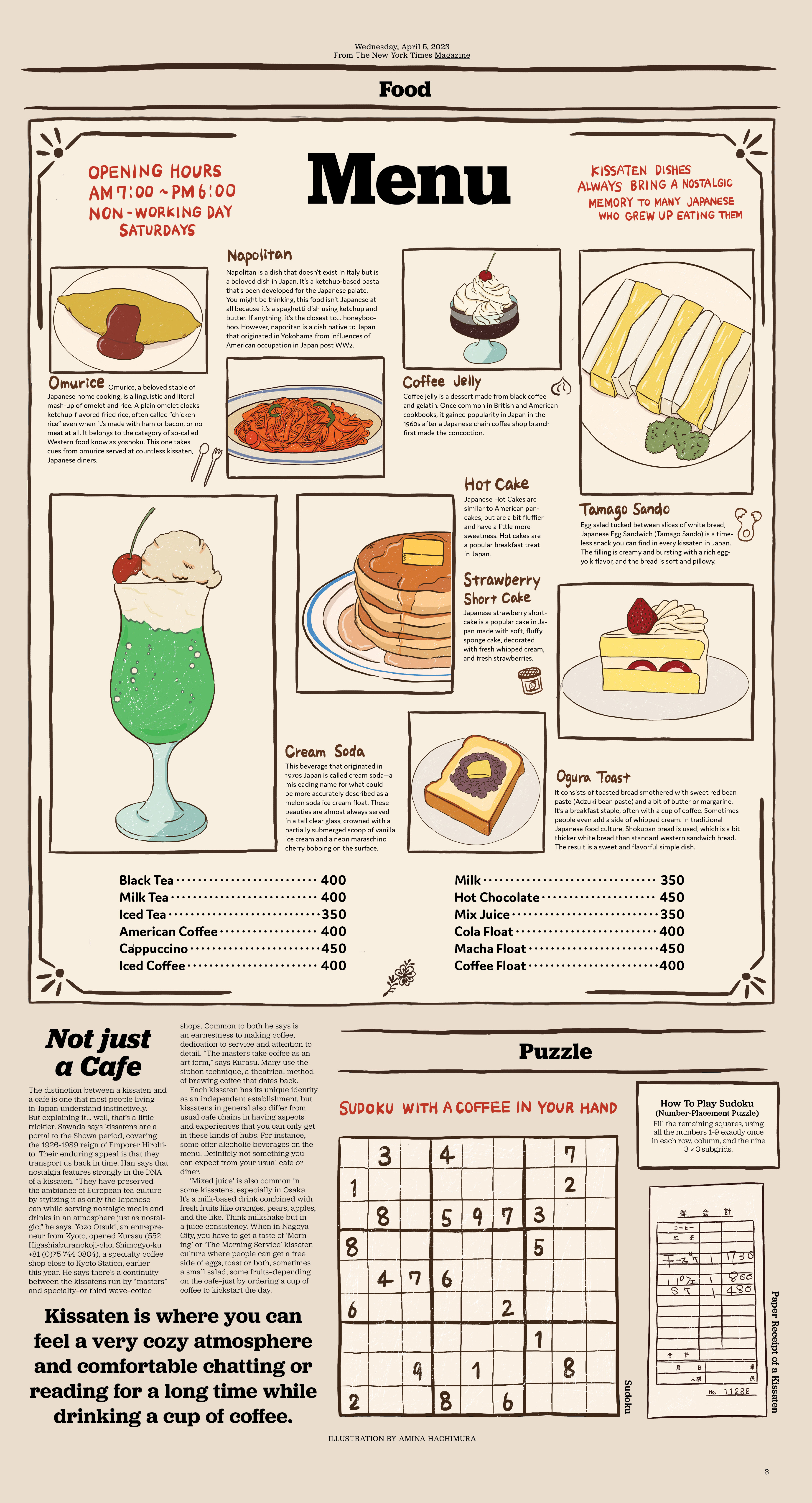
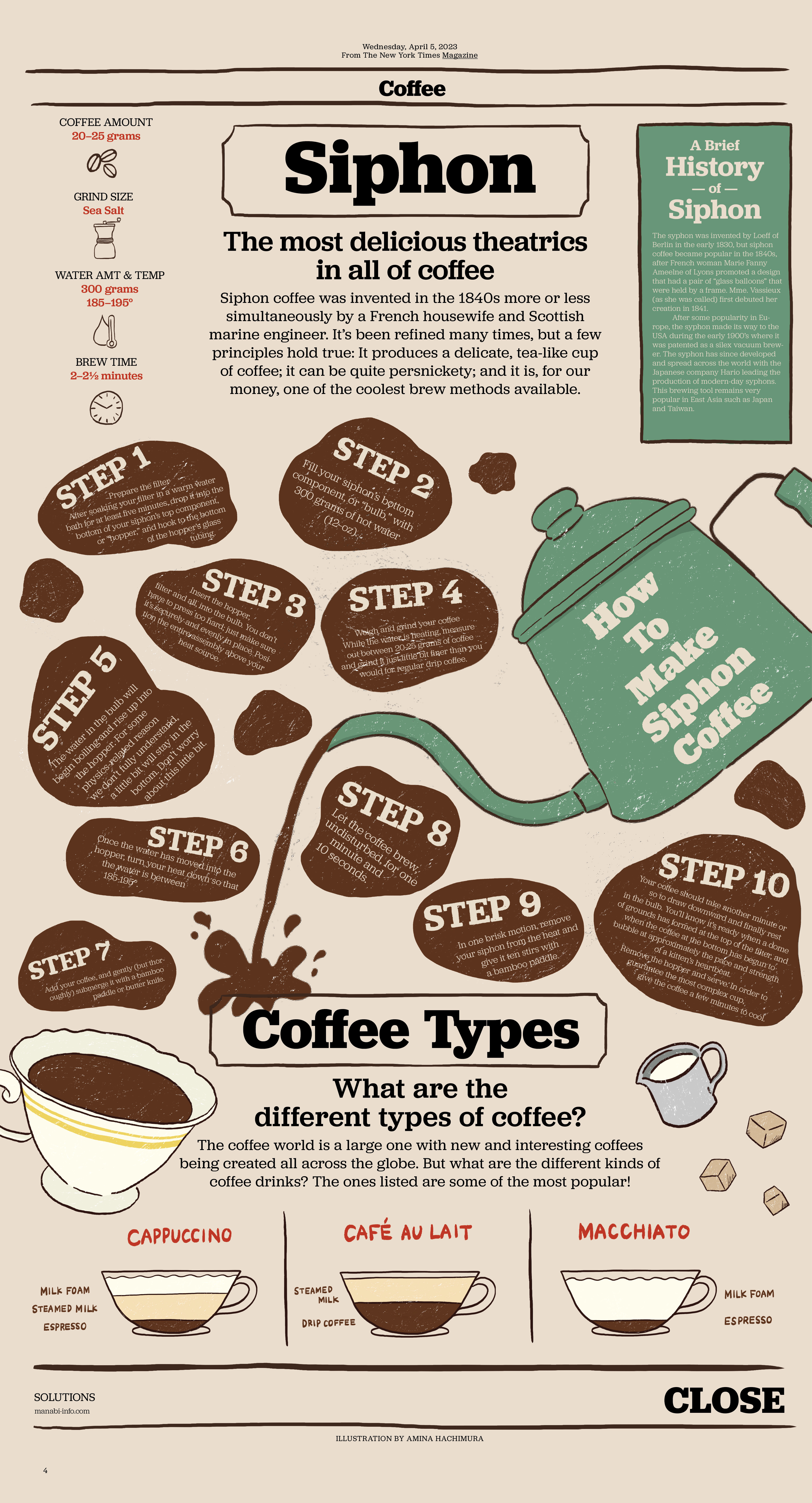
→the new york times
#editorial design
#layout design
#illustration -
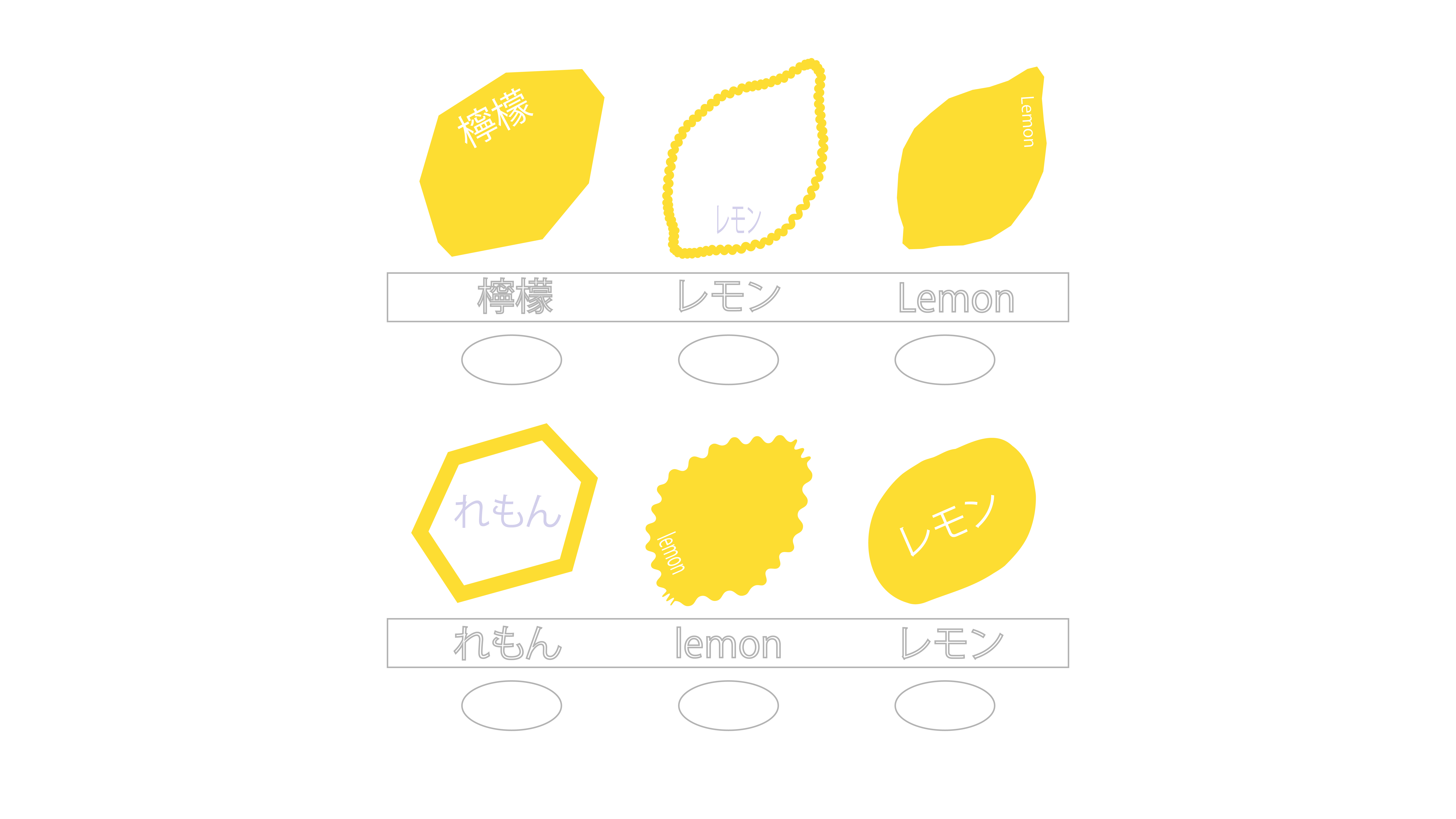
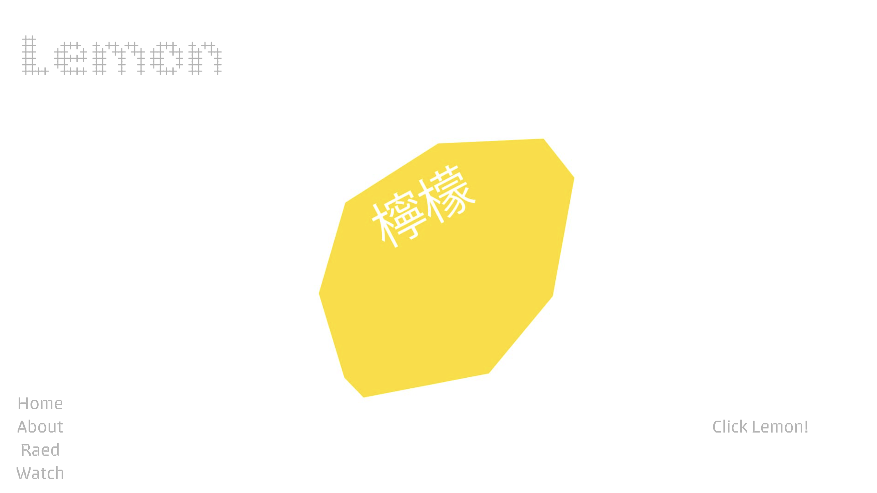
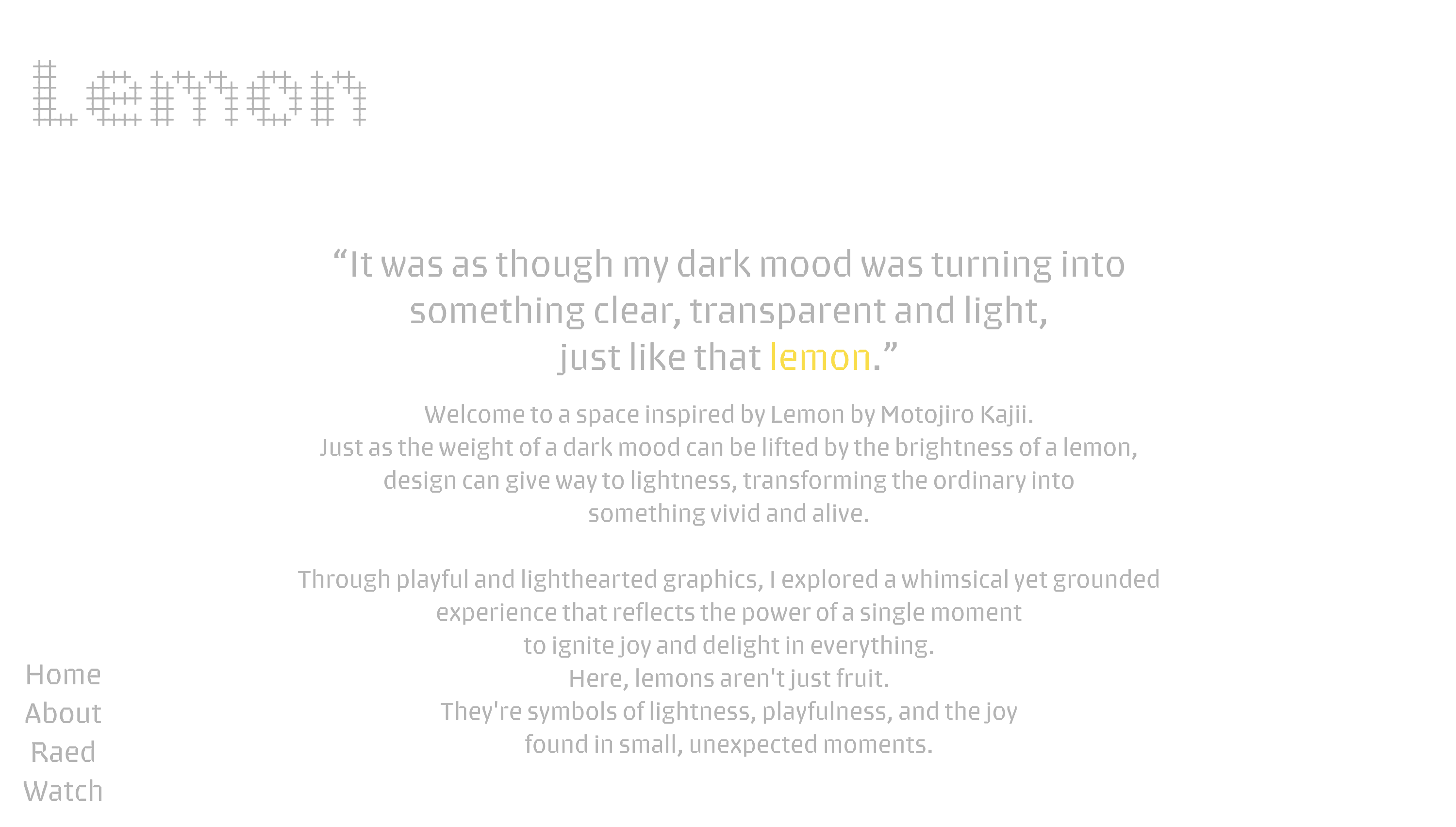
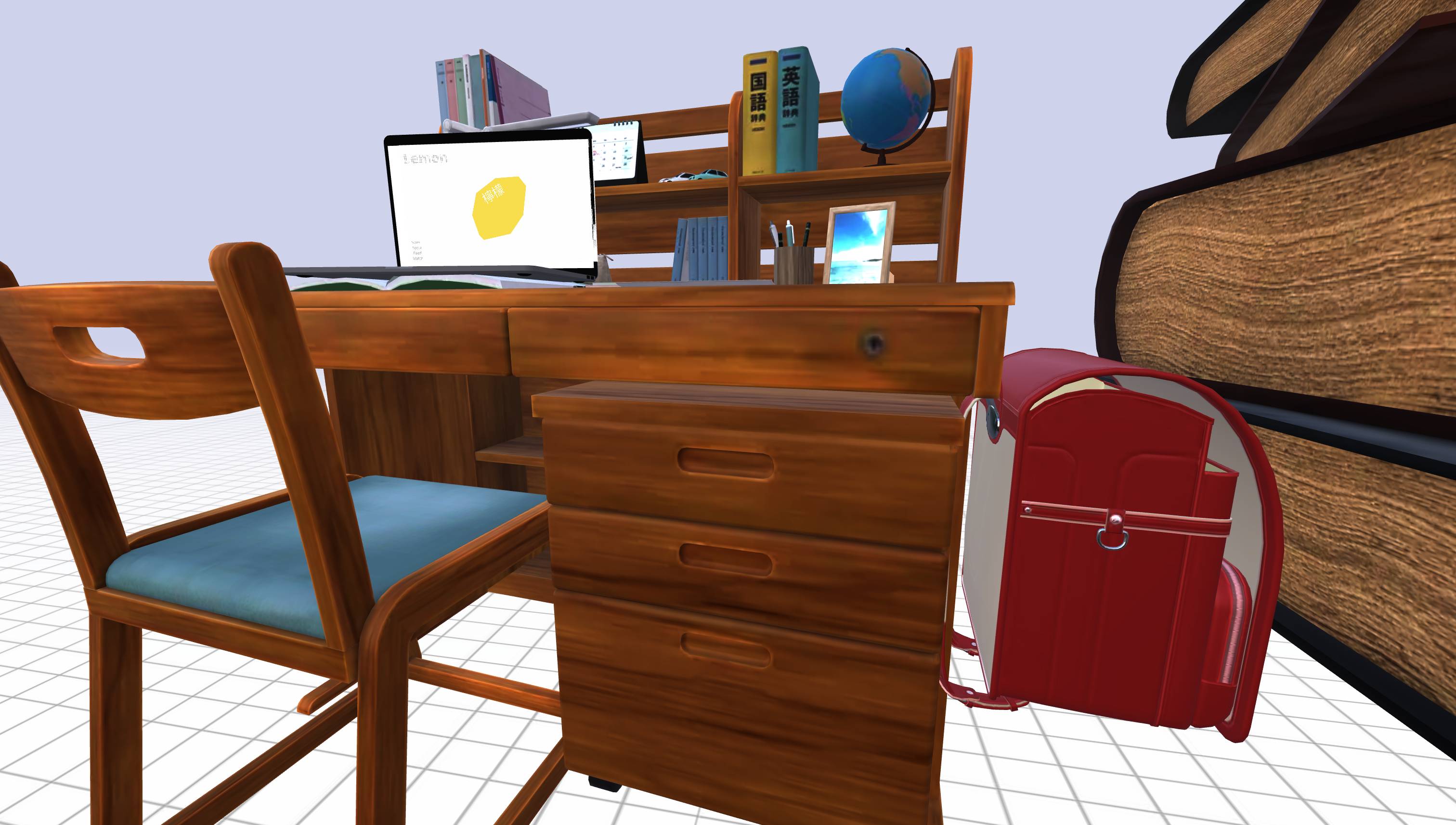
→lemon
#web design
#coding
#interactive -

→blasian photo archiver
#publication design
#editorial design
#photography
#web design -
→tatami
#publication design
#binding
#textile -

→uncharted
#publication design
#posters
#exhibition design -

→graphic designers
growth guide
#web design
-
→the art of the everyday
#monograph
#publication design
#editorial design -

→rockwell type specimen
#typography
#pablication design
about
ハイ:)
I'm amina, a graphic designer originally from Tokyo, Japan, and currently living in Boston. My work spans publication design, branding, animation, typography, web design, and illustration. Each project is an opportunity to express my feelings, emotions, and thoughts, using graphic design as my primary language of communication. I have a passion for incorporating vibrant colors, playful humor into my designs, ensuring that each piece is not only visually appealing but also emotionally resonant and intimate.
contact
instagram: @ahamity
xxx-xxxx-xxx
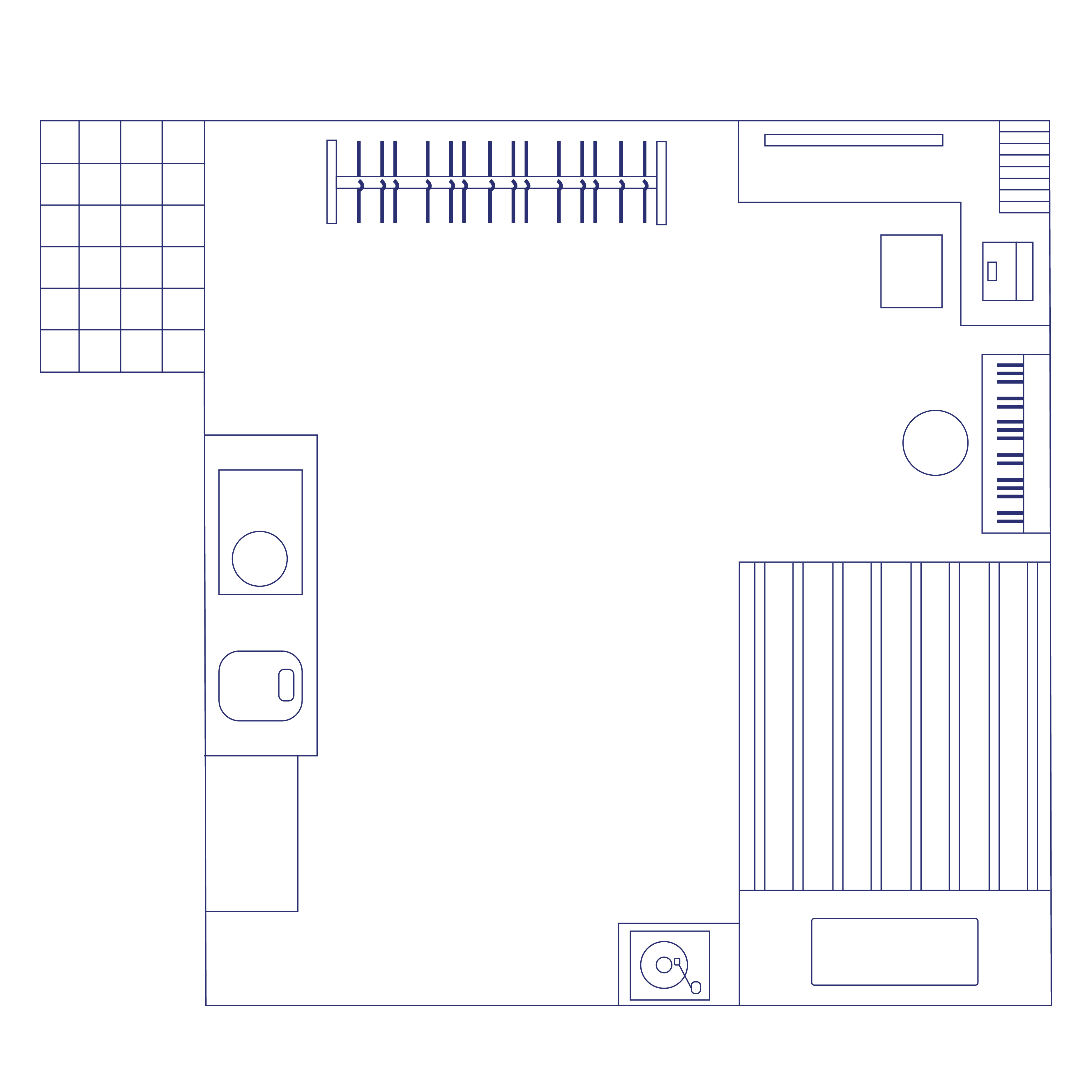
room
This website is inspired by my nostalgic childhood memories of imagining my own space and sketching blueprints on paper. These blueprints were a way for me to reimagine the spaces around me, blending thoughtful creativity with a deep desire to express my authentic self. Now, I’ve curated my current daily life within this digital space, which continues to reflect the influences I encounter in my everyday experiences.
projects
coming soon...
room
coming soon...
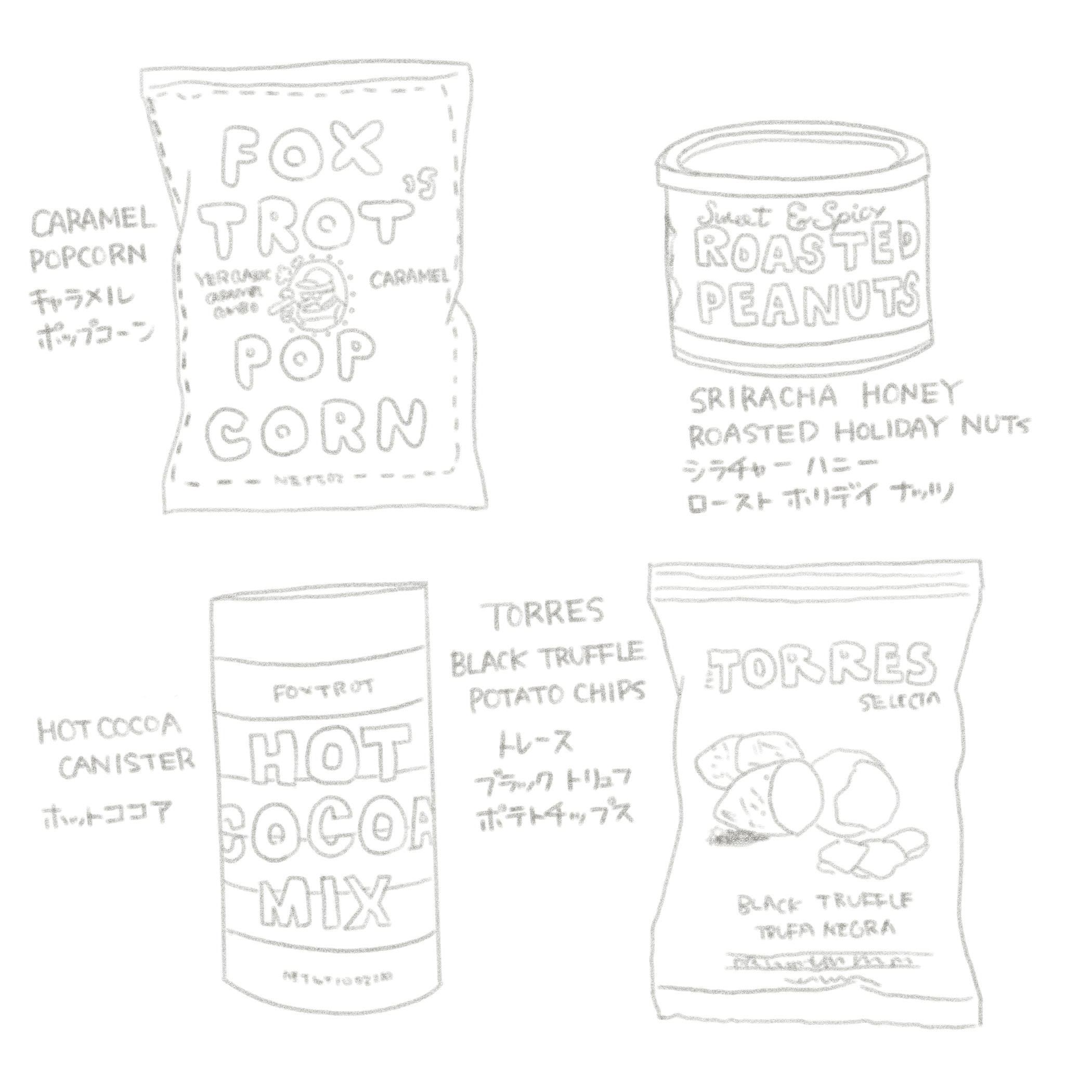
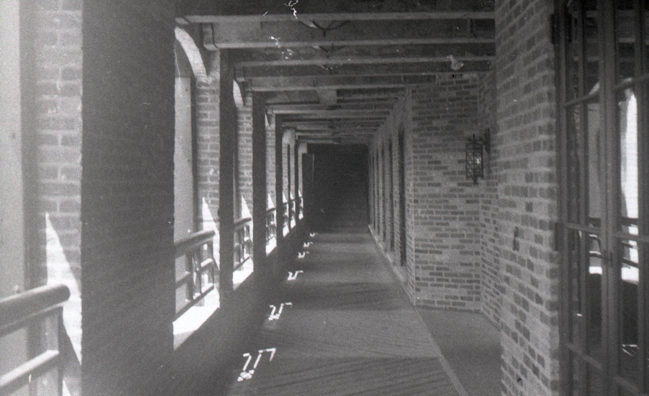
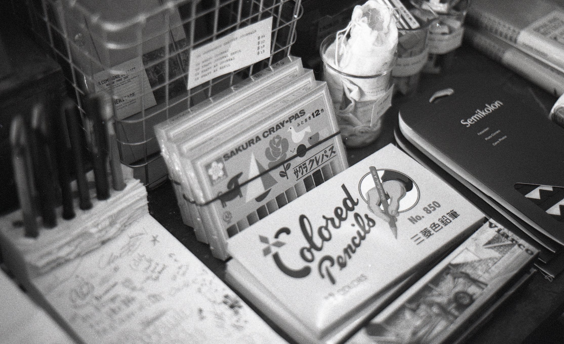
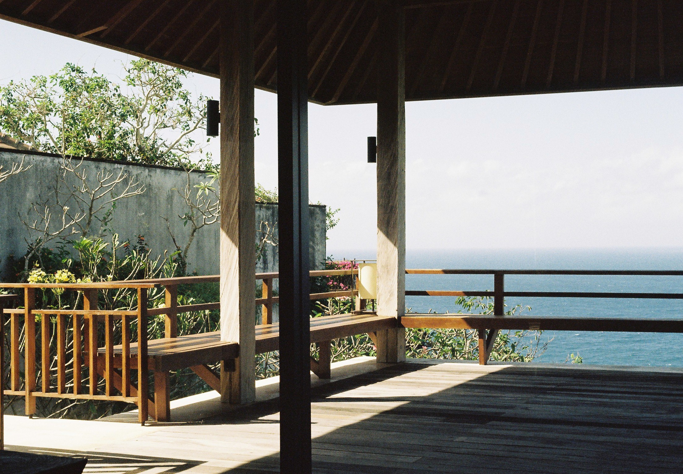
sketch
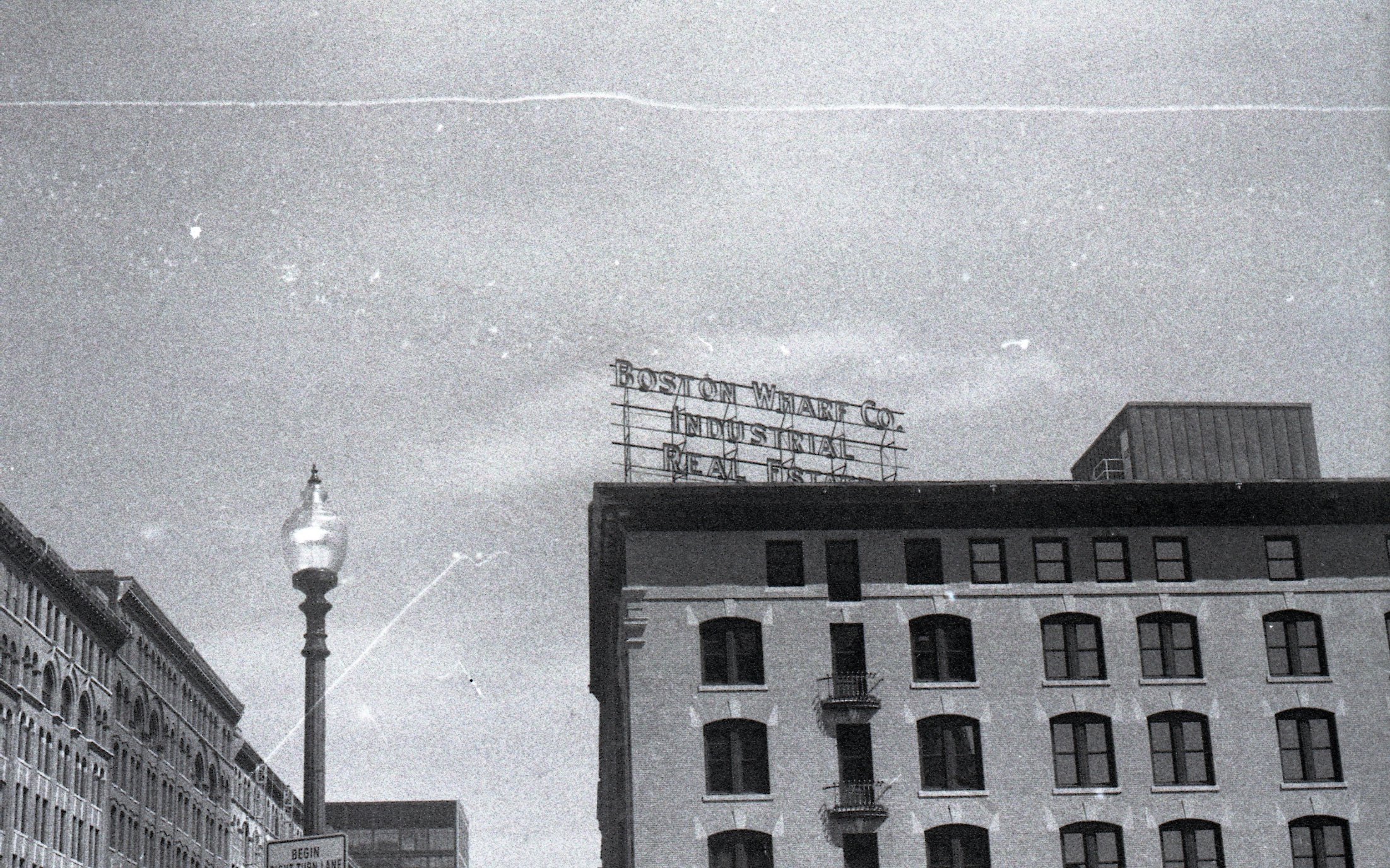
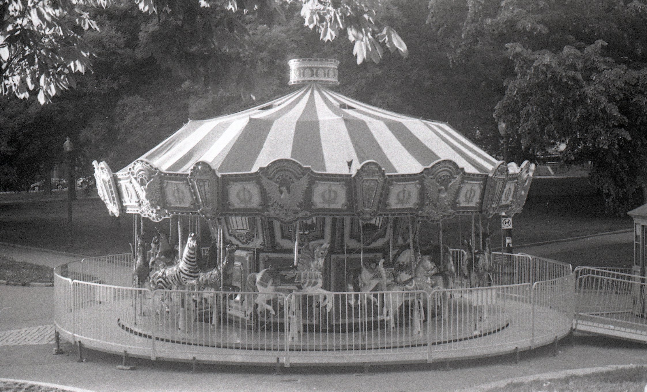
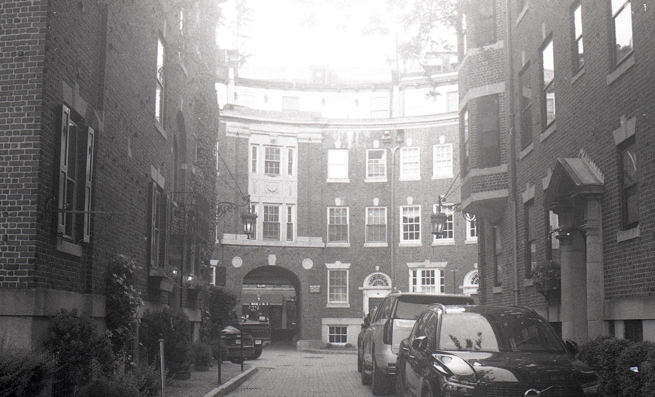
film

project 1: catalogue of influences
project 2: multiple format
project 3: tabf (tokyo art book fair)
I have undertaken a branding project for the Tokyo Art Book Fair, utilizing kinetic typography to create a unique and dynamic identity. The design concept revolves around themes of fumbling, miscellaneous items, tool boxes, drawers, paper, notes, and clippings. Central to this concept is a logo word mark inspired by the form of a paper clip.
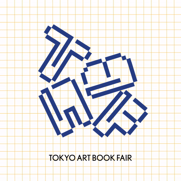
Clipping suggests the idea of assembling and curating, which is central to both the creation of art books and the event itself
The text animations simulate the act of sorting through a tool box or drawer. Letters and words shuffle, overlap, and reveal themselves in a seemingly random yet intentional manner. Smooth, flowing transitions evoke the feeling of paper sliding, notes being clipped, and items being moved, enhancing the kinetic and dynamic nature of the design.
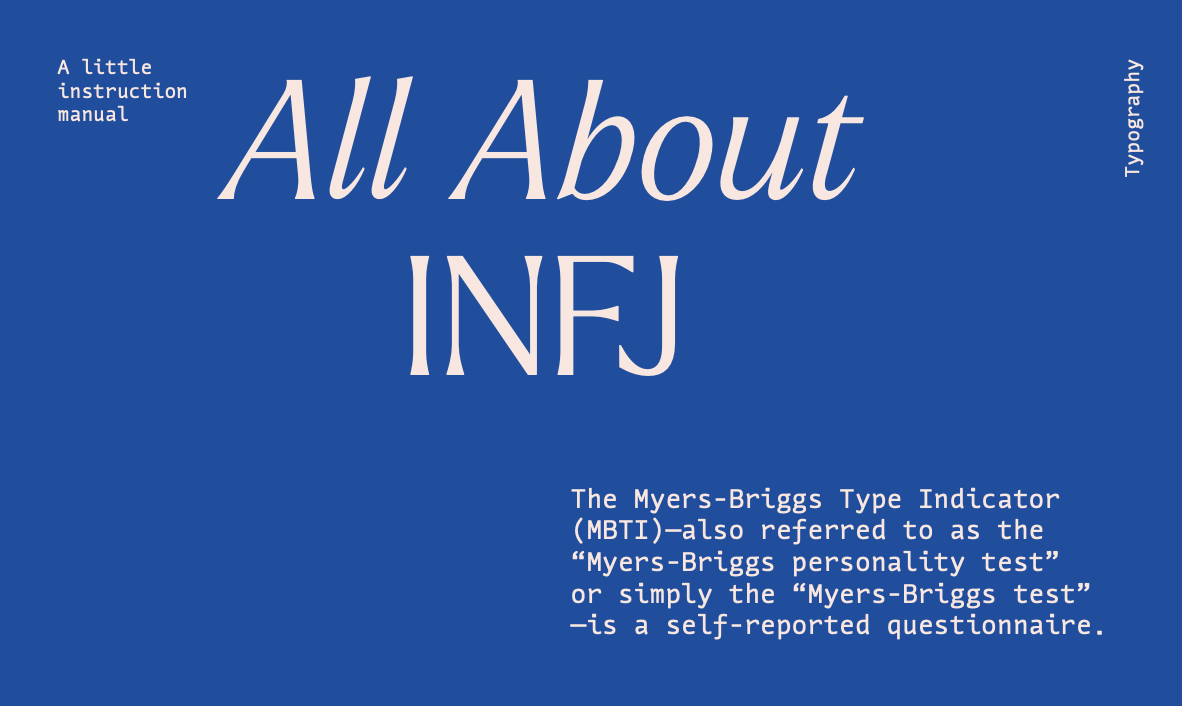
project 4: all about infj
This project involves the design of a card stock that provides information about the different personality types in the Myers-Briggs Type Indicator (MBTI). The design employs experimental typography and innovative composition to create an engaging and informative visual representation of each personality type.
By blending experimental typography with thoughtful composition, this project transforms the presentation of MBTI personality types into an engaging visual experience. Each card provides valuable information and captures the essence of the personality it represents.
project 5: print to motion>>>

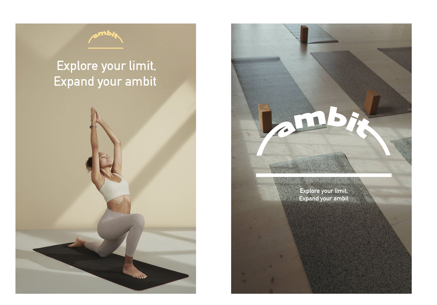
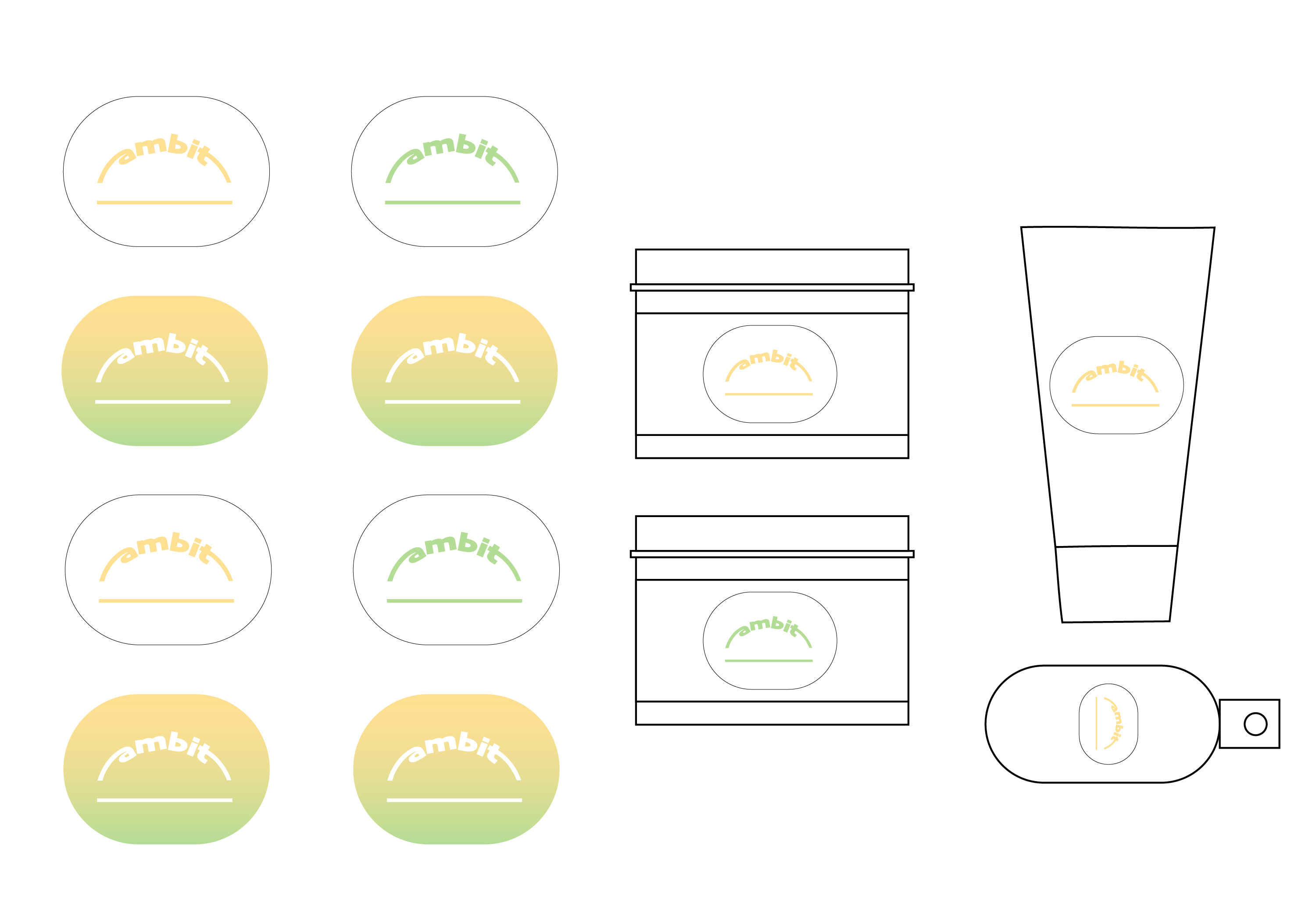
project 6: ambit [place-based identity]
The space around the yoga mat is not just a physical space for practice, but it holds significance in the practice of yoga, both spiritually and practically.
“ambit” is a self care brand, inspired by the space around the yoga mat where individuals connect with their bodies, minds and spirits, and leave behind the distractions of the outside world and focus inward. It is created to encourage personal exploration and growth and deepen their understanding of themselves and the world around them. The word ambit means the range or limits of someone’s authority and influence, which aligns with the concept of self-improvement and expansion of new dimensions of personal growth.
Logotype
Typeface: Skia / Matthew Carter
Secondary typography
Typeface: DIN Alternate Bold
Color Variation
Logo wordmark
Photo Styling
Application
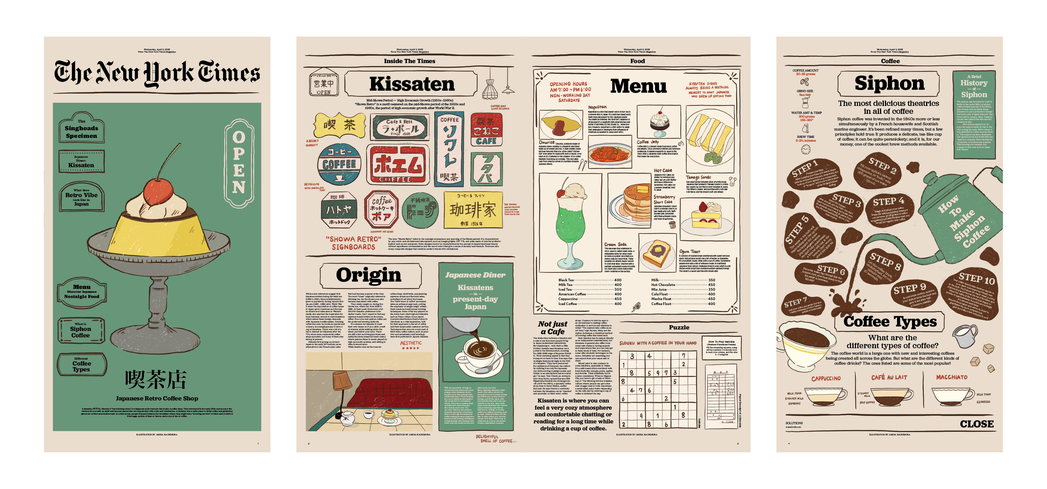
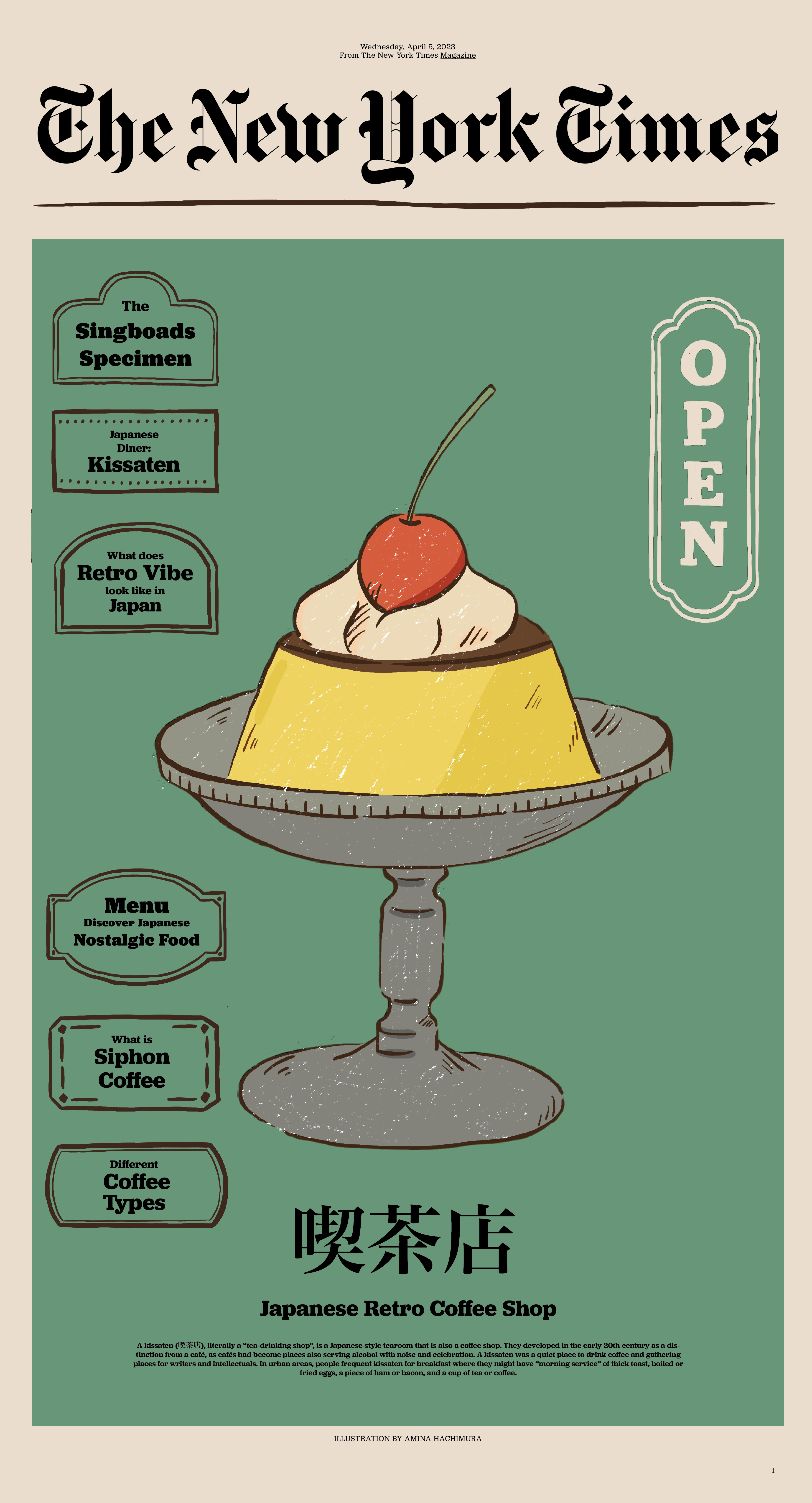
project 7: the new york times
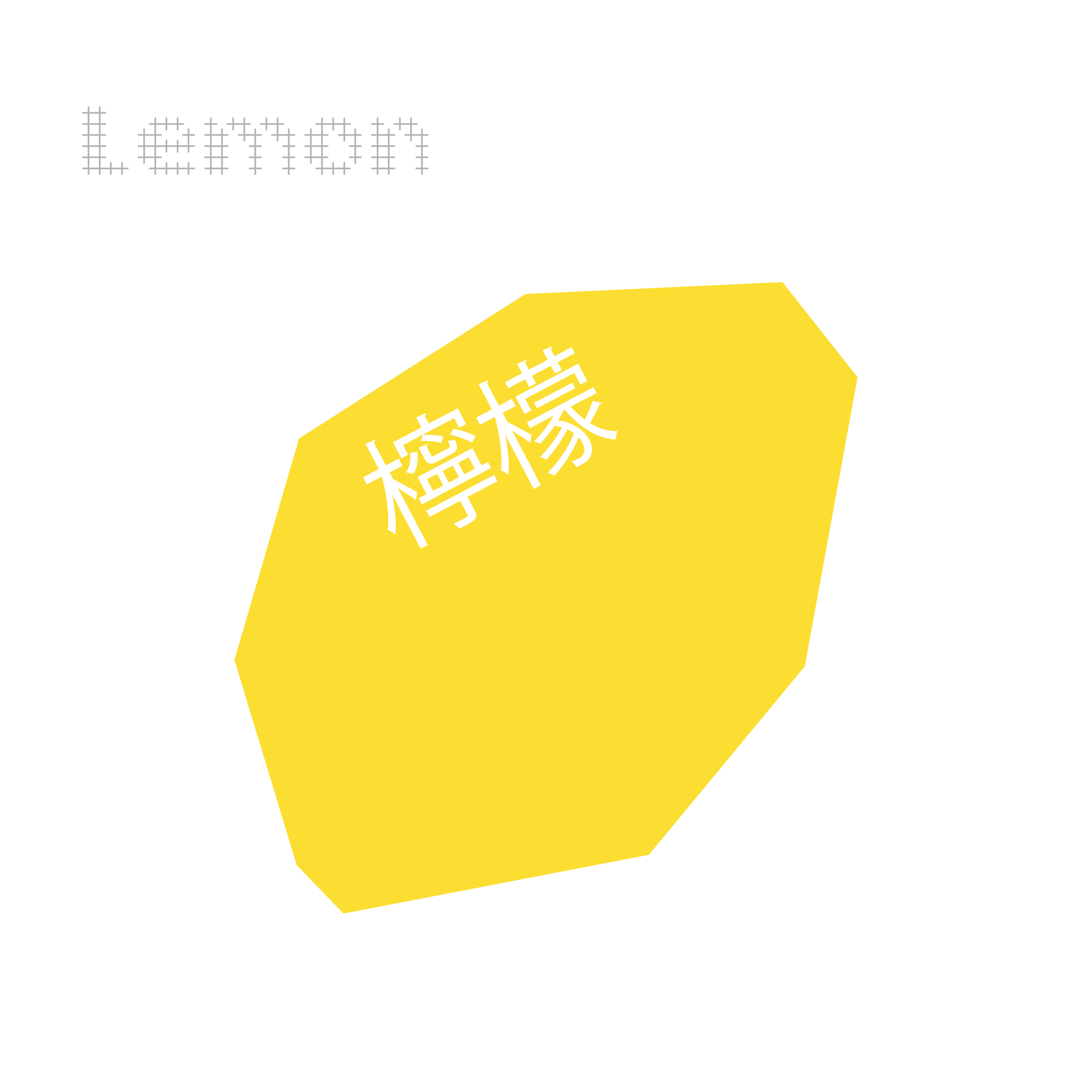
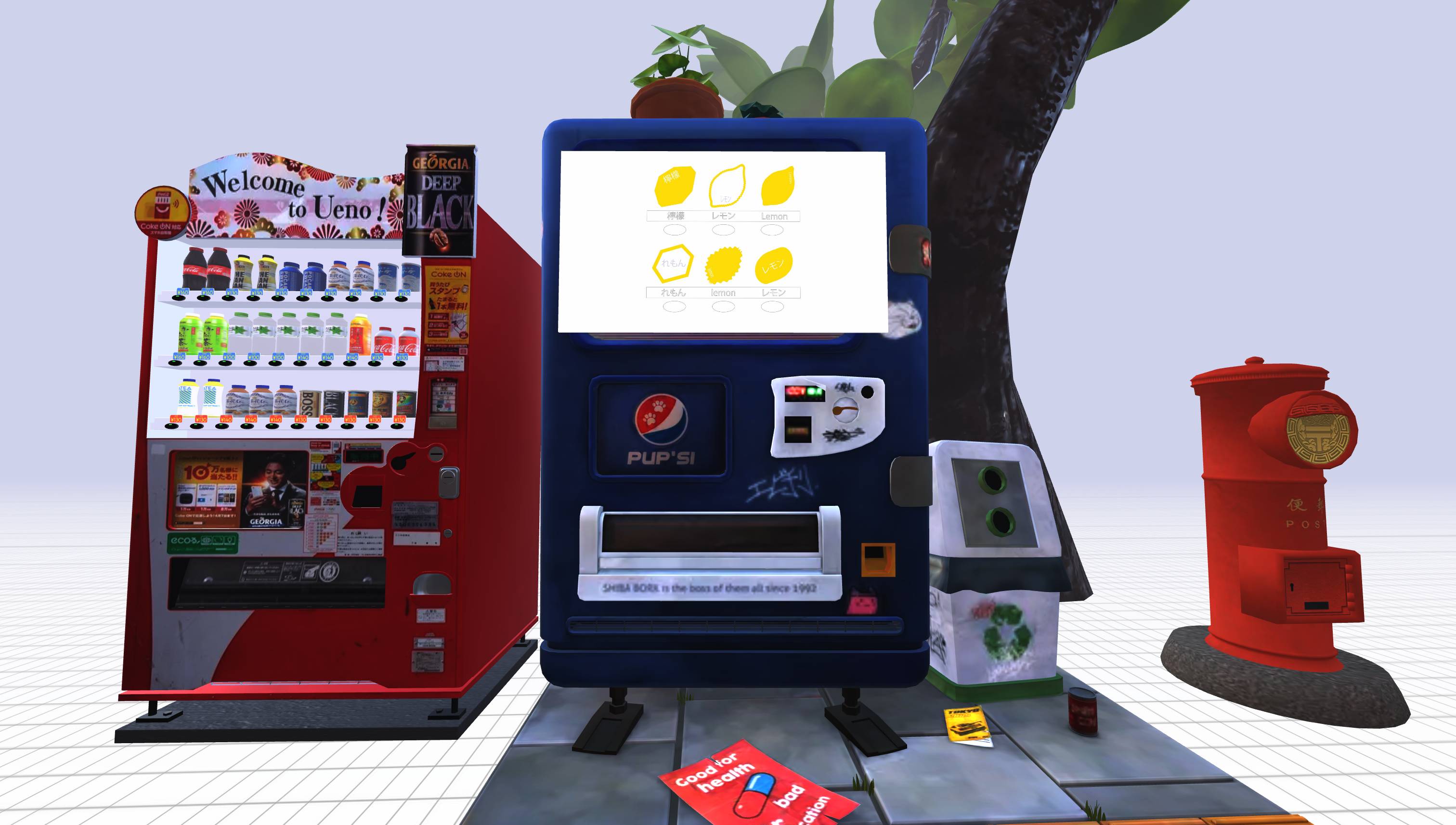
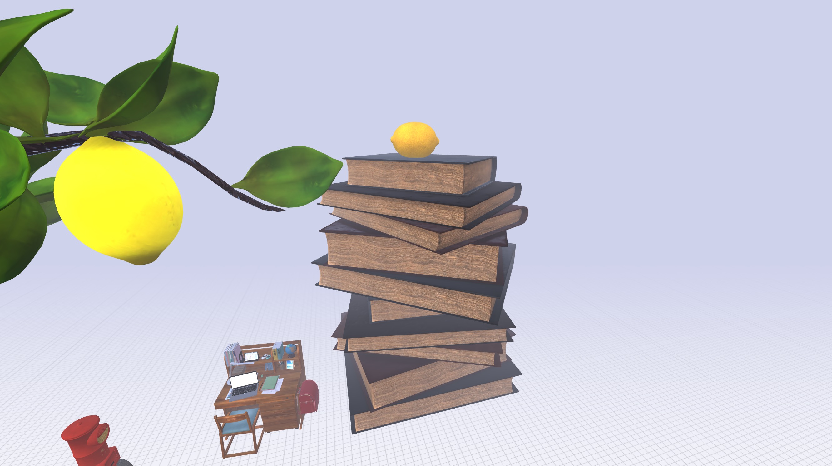
project 8: lemon
project 9: blasian photo archive
project 10: tatami
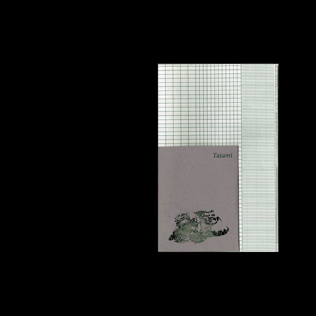
Different strands can hold strong together, weave into one another. Each strand brings its own story, challenges, and uniqueness, but when entwined, they create something profoundly personal and strong.
Tatami’s texture, with its woven interlacing, can represent the blending and overlapping of two distinct cultures—much like the lived experience of being half Japanese and half Black.
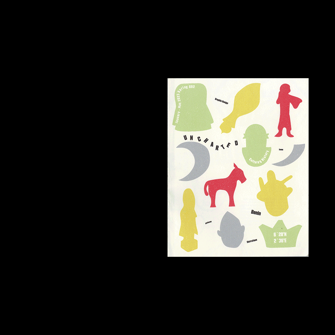
project 11: uncharted
project 12: graphic designer's growth guide
Gardener’s Map is a collaborative project that serves as a growth guide, collecting questions and answers about graphic design from all participants. As the website lead, I designed and developed an interactive platform that embodies the project’s theme of growth and learning. A key visual element of the project is the use of flower icons, each created by a classmate, symbolizing individual contributions to the collective knowledge. Inspired by the book design lead’s concept of pages spreading into a flower shape, I integrated these icons into an interactive navigation bar, visually representing a blooming flower. This design choice reinforces the idea that growth in design comes from shared learning and collaboration.
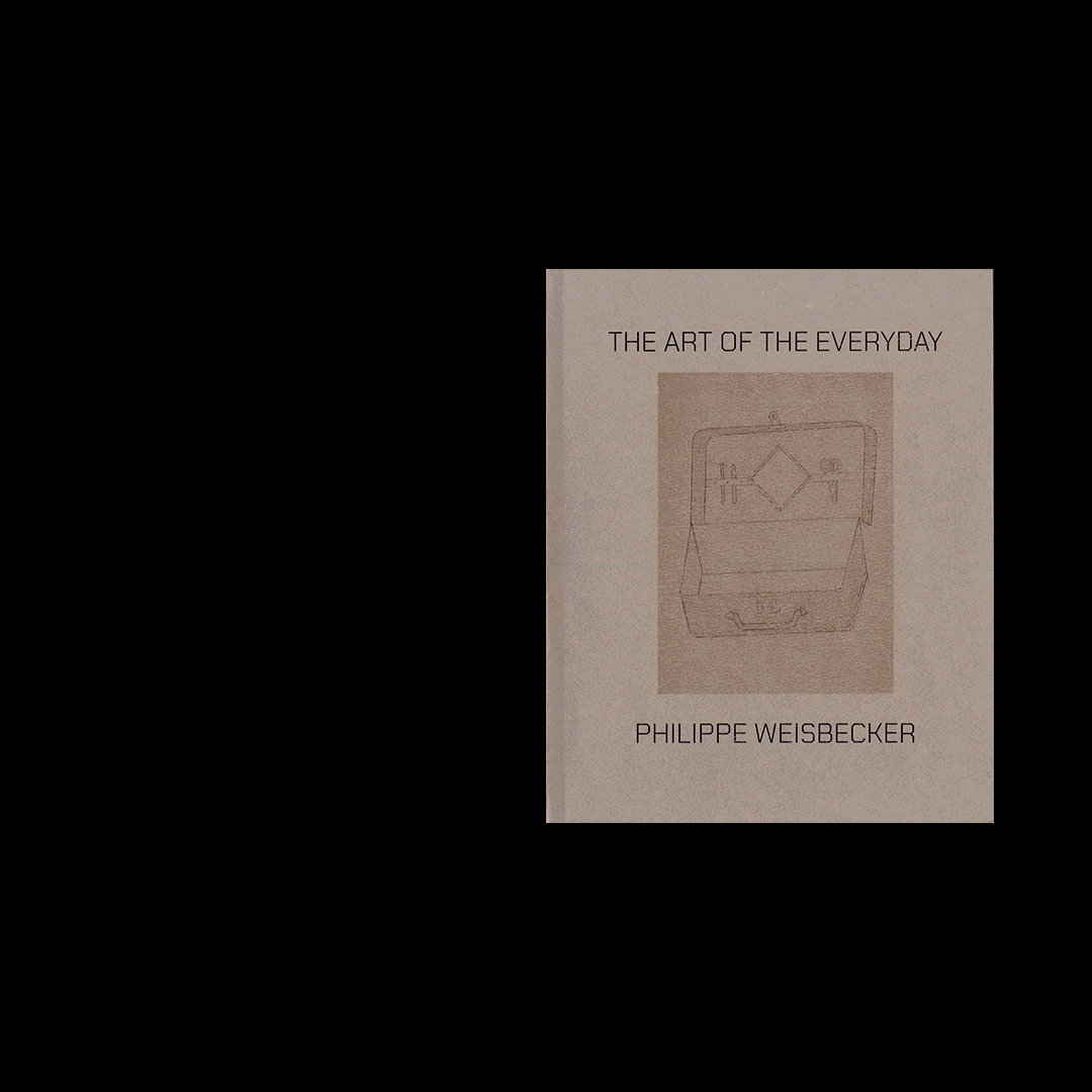
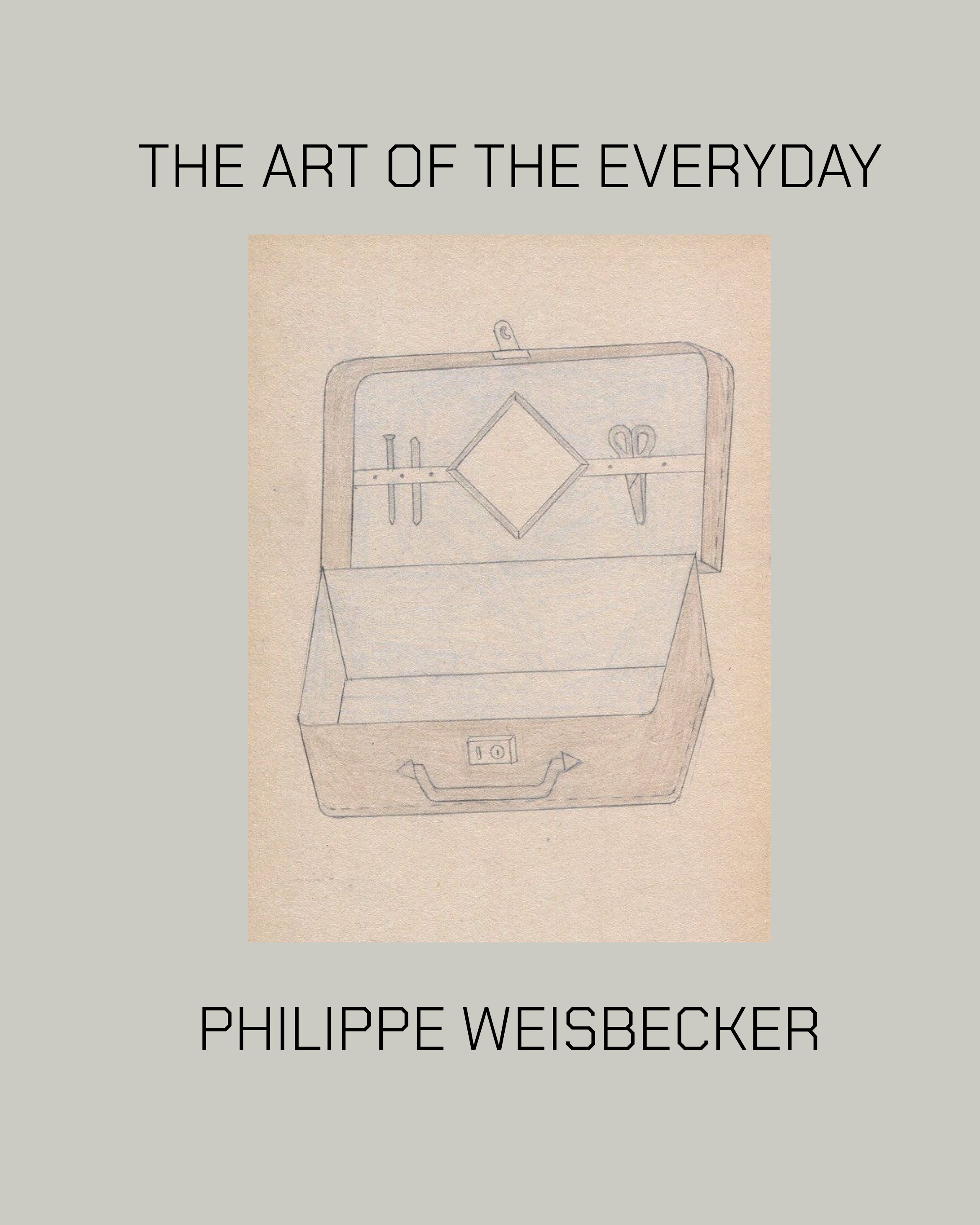
project 13: the art of the everyday / philippe weisbecker
"THE ART OF THE EVERYDAY" is a thoughtfully designed publication showcasing the works of Philip Wisebecker. The typography, inspired by the geometric nature of his sketches, complements his precise yet playful approach to form and structure. Through a clean and minimal layout, the design emphasizes Wisebecker's unique visual language, inviting readers to engage with his work in an intimate and tactile way.